Which font was used in Nazi Germany?
-
Sampo Jämbeck
- Member
- Posts: 118
- Joined: 06 Aug 2007, 15:14
- Location: Finland
Re: the nazis font?
I'd like to know what font they used in Triumph des Willens.
-
PieterMarinus
- Member
- Posts: 18
- Joined: 28 Sep 2013, 16:06
Re: the nazis font?
Antiqua, see M. Bormann letter below, this was to be THE official font.
German Text
Letterhead:
Nationalsozialistische Deutsche Arbeiterpartei
Der Stellvertreter des Führers
München 33, den [Datum (leer)], Braunes Haus
Stabsleiter
z. Zt. Obersalzberg, den 3.1.41
R u n d s c h r e i b e n
(Nicht zur Veröffentlichung)
Zur allgemeinen Beachtung teile ich im Auftrage des Führers mit:
Die sogenannte gotische Schrift als eine deutsche Schrift anzusehen oder zu bezeichnen ist falsch. In Wirklichkeit besteht die sogenannte gotische Schrift aus Schwabacher Judenlettern. Genau wie sie sich später in den Besitz der Zeitungen setzten, setzten sich die in Deutschland ansässigen Juden bei Einführung des Buchdrucks in den Besitz der Buchdruckereien und dadurch kam es in Deutschland zu der starken Einführung der Schwabacher Judenlettern.
Am heutigen Tage hat der Führer in einer Besprechung mit Herrn Reichsleiter Amann und Herrn Buchdruckereibesitzer Adolf Müller entschieden, dass die Antiqua-Schrift künftig als Normal-Schrift zu bezeichnen sei. Nach und nach sollen sämtliche Druckerzeugnisse auf diese Normal-Schrift umgestellt werden. Sobald dies schulbuchmässig möglich ist, wird in den Dorfschulen und Volksschulen nur mehr die Normal-Schrift gelehrt werden.
Die Verwendung der Schwabacher Judenlettern durch Behörden wird künftig unterbleiben. Ernennungsurkunden für Beamte, Strassenschilder u. dergl. werden künftig nur mehr in Normal-Schrift gefertigt werden.
Im Auftrage des Führers wird Herr Reichsleiter Amann zunächst jene Zeitungen und Zeitschriften, die bereits eine Auslandsverbreitung haben, oder deren Auslandsverbreitung erwünscht ist, auf Normal-Schrift umstellen.
gez. M. Bormann
English Translation
Letterhead:
National Socialist German Workers Party [Nazis]
Deputy to the Führer
Munich 33, on [date - empty space], Brown House [Nazi headquarters]
Stabsleiter (Chief of Staff)
currently in Obersalzberg, 3 January 1941
C i r c u l a r L e t t e r
(Not for publication)
For general notice I announce the following by order of the Führer:
It is false to regard or describe the so-called Gothic typeface as a German typeface. In reality the so-called Gothic typeface consists of Schwabacher-Jewish letters. Just as they later came to own the newspapers, the Jews living in Germany also owned the printing presses when the printing of books was introduced and thus came about the strong influx into Germany of Schwabacher-Jewish letters.
Today the Führer, in a discussion with Herr Reichsleiter Amann [Reich Leader for the Press] and the printing company owner Herr Adolf Müller, decided that Antiqua [Roman] type is henceforth to be designated as the standard typeface. Gradually, all printed matter should be converted to this standard typeface. As soon as possible in regard to school textbooks, only the standard script will be taught in village and elementary schools.
The use of Schwabacher-Jewish letters by authorities will in future cease; certificates of appointment for officials, street signs, and the like, will in future only be produced in standard lettering.
By order of the Führer, Herr Reichsleiter Amann will first change over to the standard script those newspapers and magazines that already have foreign circulation or whose foreign circulation is desired.
sgd. M. Bormann
Re: Which font was used in Nazi Germany?
I don't think anyone has yet mentioned DIN 1451, designed in 1931. The Wiki article discusses some aspects of its use, and it was (and still is) an extremely common typeface in Germany. It has distinctive lowercase L; lowercase F and T, the 4 and the eszett are also distinctive.
DIN 1451 was common on the railways (where it originated) and was also used on the Autobahnen. Even when signage was hand-lettered or stenciled it was often done in a DIN 1451-like script -- for example, the "Achtung Feuerstrahl!" on the Panzerfaust.
The font comes in several weights -- Engschrift (condensed), Mittelschrift (the standard spacing, IIRC), Fette Engschrift (bold condensed) and so on.
Re: Which font was used in Nazi Germany?
There is an interesting if sadly incomplete discussion of German typefaces -- the "Nazi font" -- at http://www.typophile.com/node/64037.
-
ghostsoldier

- Member
- Posts: 1461
- Joined: 12 Apr 2007, 22:52
- Location: Florida, USA
Re: Which font was used in Nazi Germany?
Did we ever discover what this font was called?
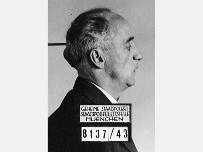
http://www.ovb-online.de/bilder/2013/10 ... 6-i534.jpg
It's Kurt Huber's Gestapo mug shot, but the font looks to be the same as the RC chit posted earlier...
Rob

http://www.ovb-online.de/bilder/2013/10 ... 6-i534.jpg
It's Kurt Huber's Gestapo mug shot, but the font looks to be the same as the RC chit posted earlier...
Rob
"Even God cannot change the past. "
-Agathon (448 BC - 400 BC)
-Agathon (448 BC - 400 BC)
Re: Which font was used in Nazi Germany?
The common font found in 30s literature was a variation of Fraktur. I've found a number of versions that are very similar, but none the same. Small variations in the shape of many letters and no option for the letter combinations that were used (ie. tz, st, ch etc.) After speaking to a Fraktur expert in Germany many years ago, established that it isn't actually available as a font. Once you get used to it, it isn't that hard to read, just a shame that my actual German is so terrible.
I got a program to create fonts with the intention of creating a good representation of it but it's well down the list of priorities.
Cheers
Allan
I got a program to create fonts with the intention of creating a good representation of it but it's well down the list of priorities.
Cheers
Allan
Re: Which font was used in Nazi Germany?
Are you sure about that ?HerrLyppe wrote: After speaking to a Fraktur expert in Germany many years ago, established that it isn't actually available as a font.Allan
Lots of Fraktur[ish] fonts and info here
http://www.morscher.com/3r/fonts/fraktur.htm
Greetings from the Wide Brown.
Re: Which font was used in Nazi Germany?
Hi Max,
Thanks for the link, I haven't seen that list before. Looking at some individual letters amongst those, some do seem to be very good candidates. Particularly when looking at lower case. Unfortunately none of them seem to fit the bill when comparing multiple letters within the same set. I think the closest is probably Mars Fraktur which has very distinct differences in letters like the G, R and U etc.
Some time ago I made up a quick reference sheet to save myself from having to defamiliarise myself with the font whenever I sit down to go through manuals. It makes an easy comparison when looking at examples like that.
Cheers
Allan
-
Beckmann Frich
- Member
- Posts: 2
- Joined: 14 Nov 2014, 15:13
Re: Which font was used in Nazi Germany?
Stimmt,gotik
- Attachments
-
- eaf81a4cf5da6bb8d62afc73.jpg.png (16.21 KiB) Viewed 5366 times

-
THEWULFMAN

- New member
- Posts: 1
- Joined: 02 Oct 2016, 12:13
- Location: USA
Re: Which font was used in Nazi Germany?
ghostsoldier wrote:Did we ever discover what this font was called?
http://www.ovb-online.de/bilder/2013/10 ... 6-i534.jpg
It's Kurt Huber's Gestapo mug shot, but the font looks to be the same as the RC chit posted earlier...
Rob
So I don't know if there are rules against necro-posting, but I thought I'd provide some relevant information since I found this thread during my night-long journey to find the font used in this mugshot.
The font is a part of the Super Grotesk family, designed by Arno Drescher in the 1930s. Variants of the font were used post-war by East Germany as an alternative to Futura (which had become associated with the West).
I don't know if this specific variant of Super Grotesk ever got digitized, probably not.

Re:
This I would really like to read. How is progress going? Or is it explained in an earlier thread buried elsewhere on here?!mty wrote:.. I'm also working on a university thesis about the graphic design and "style guide" of the SS. I will add more information to this thread when I have advanced with that a bit more.
Re: Which font was used in Nazi Germany?
Looking for info on the font used for the Reichsbahn. The closest I've found seems to be Alte DIN 1451 Mittleschrift (medium to heavy) although it appears to be a little too round, less block-like. Many of the other DIN 1451 fonts I have seen have the wrong "t".
JB
-
WChurchill

- Member
- Posts: 8
- Joined: 11 Oct 2020, 20:20
- Location: UK
Re: Which font was used in Nazi Germany?
Can anyone tell me what font this is please?
Thanks
- Font.jpg (22.68 KiB) Viewed 2315 times
Winston ChurchillSuccess is the ability to go from failure to failure without losing your enthusiasm

Re: Which font was used in Nazi Germany?
Good afternoon to the topic,
a search for "Typography in National Socialism" (Typografie/Typographie im Nationalsozialismus) throws up tons of results, it would take weeks to look at all these links...
The book "NSCI – Das Erscheinungsbild der Nationalsozialisten" by Herr Andreas Koop is very well recommended,
for anyone, interested in this topic:
Link: https://www.designtagebuch.de/nsci-das- ... zialisten/
verlag hermann schmidt / NSCI https://typografie.de/produkt/nsci/
Hans1906
P.S. I am collecting older editions of the german magazine "Gebrauchsgraphik" for many years, one of the best sources on this topic,
especially for the years after 1924...
Link: https://de.wikipedia.org/wiki/Novum_(Zeitschrift)
Some vintage cover shots from the german edition of "Gebrauchsgraphik" here:
https://www.google.com/search?q=gebrauc ... 60&bih=759
Even the history of the "Logo" of the SA / Sturmabteilung is most complexe, but, like always, another story...
The paradise of the successful lends itself perfectly to a hell for the unsuccessful. (Bertold Brecht on Hollywood)